Roses Are Red
Art Design of Roses Are Red
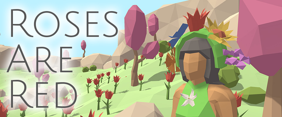
🌹 Roses Are Red is a relaxing experience where you play as Mother Nature and fill the world with flowers. Play the game on itch.io.
🖋️ In this devlog I’ll elaborate on the art design of the project, more specifically the flat color scheme with bright pastels and the low poly style with hard edges. Enjoy!
Also see the other devlogs about music design & what I learned from the project.
🎨 Flat Pastel Color Scheme
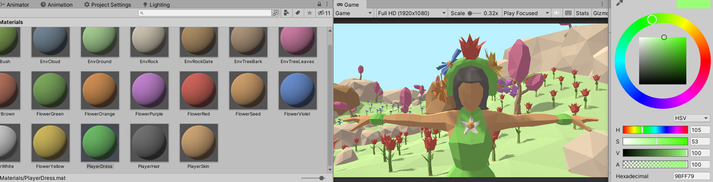
There are two main reasons why I’m using flat colors (no gradients, no painted textures).
- It works well with the hard edge low poly artstyle, since the only difference in color now comes from the lighting, accentuating the different polygon surfaces.
- It’s extremely efficient to create: you only need to design the color scheme itself. No unwrapping. No texturing.
For the color scheme itself I used pastels, since it fits best with the desired relaxed mood of the game.
- Value is mostly at 100%. Only the rocks & character hair are a bit lower. The “black” hair is actually a mid grey of about 40%, to match with the bright style.
- Saturation sits between 30-60%. Important elements such as the flowers have the highest saturation, while environment props have the lowest.
🖌️ Low Poly Style with Hard Edges
The concept of this art style is to make every edge of the 3D model hard, meaning that the edges are clearly visible and not softened out by the rendering engine. As a result we can get quite low-poly & reduce modelling time, without the edges becoming visible by accident since they are already visible by design. To pull this off, I took the following into account:
- Polygon density must be consistent in order for the models to look coherent (since all the polygons are basically visible). I actually softened some of the edge loops near the character joints, so you don’t see them in game, thus maintaining consistent length of the visible (hard) edges.
- You can and should break the consistent density to accentuate certain objects and guide the viewer towards important focal points: I made the environment props very sparse (not important, limited detail), while the flowers and the character are a lot denser (main gameplay elements).
- Angles between surfaces should not be too low. At least 10° is ideal, to make sure there’s enough difference in the orientation of neighbouring surfaces, which will make the light reflect differently on every surface, thus accentuating the edges and making the low poly style reach its full potential. A good example of this is the groundplane: I randomised the height of every vertex, so you can really see every single triangle well.
- Polygon shape within a model should be consistent. I made the character mostly out of quads (4 sided surfaces), while the environment props are mostly triangle based (3 sided surfaces).

Thanks for reading!
💬 Comment below to share your thoughts & suggestions.
🎮 Check out my other games & devlogs
🎨 Check out my other projects
Have a nice life ❤️
~ Tijmen
Leave a comment
Log in with itch.io to leave a comment.